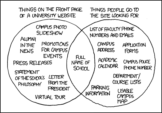
There’s a famous XKCD comic strip that is no doubt taped to a few higher ed web designers’ cubicles. It’s a Venn diagram of “Things on the front page of a university website” vs “Things people go to the site looking for.” Of the two lists, only one item intersects: the name of the school.
The biggest problem that higher ed web designers face is trying to design a website that appeals to multiple constituencies. Current students want to find information like dining hall hours and if finals are postponed because of snow. Prospective students want to find major options and information about campus life. Parents want to know about quality and cost.
However, higher ed organizations often request website front pages that cater to yet another constituency: stakeholders and donors. Fundraising is the unspoken, predominant goal of nearly all colleges and universities, and for good reason: even with continually rising tuition, every year many colleges and universities fail to meet their operating costs. This means that higher ed websites take a calculated risk: they assume that students will eventually figure out when the dining halls are open, but they know they have only one chance to impress a potential donor.
So higher ed websites fill their front pages with lists of awards and carousels of accomplishments, and bury any usable information deep within the sitemap. However, a few universities are starting to get it right, working with designers to create websites that show a functional profile of the school. Here are some of my favorite examples.
Sanford Brown

Healthcare jobs are rising at over twice the rate of all other job categories, and healthcare education and training programs are jumping in to train the necessary staff. SanfordBrown.com is an example of a specialized educational program working to fill this niche.
SanfordBrown’s site has the traditional “educational carousel” model, but intercuts images of its accomplishments with practical information like how to calculate financial aid. A prospective student visiting SanfordBrown’s website knows instantly how to apply, how to determine the cost of the degree, and how the degree prepares students for jobs in healthcare.
The awards info and donor-centric text comes below the fold, which I think is exceptionally appropriate: not only does it keep the most pertinent, usable information at the top of the website, it shows donors and stakeholders that the school is a student-centered educational institution. It’s a win-win.
West Virginia University
 University web designers now have two challenges: to design one version of the website for browsers, and another for mobile interfaces. We’ve all been on our smartphones, frustrated with that website where you have to push and pull the text around the screen because it wasn’t designed for mobile interfaces.
West Virginia University absolutely nails their mobile interface, providing an image-free (minus the university logo, of course) streamlined site with a number of expandable tabs. The A-Z site index is at the top, the search bar is right under it, and information for current students, prospective students, faculty, staff, parents, and donors each has its own clearly-designated section.
Best of all: right at the bottom of your mobile screen are two buttons in red and gold: Apply Now and Donate Now. This is a mobile website with a very clear mission and goal.
Coursera
Why am I including an online program like Coursera on the list? Because it’s another bright spot in the world of higher education. Unlike it’s competitor, Khan Academy, Coursera doesn’t require you to register with the site before reviewing its options (a key distinction in today’s “Sign in via Facebook” culture). Coursera states its mission: “Take the world’s best courses, online, for free,” then lets you jump right in and start exploring.
I think we’ll see more schools like Coursera in the next 10 years. Even well-established universities, such as Stanford, are offering online versions of their degree programs. This presents a fun challenge for web designers, UI specialists and anyone interested in cloud storage, video display or discussion board interfaces – programmers will be tasked with making these educational websites quick to load, easy to navigate and simple to interact with. I look forward to seeing what develops.
For more well-designed university websites, visit WebCredible’s University Websites – Who’s Making the UX Grade? Then log on to your alma mater’s website – or pull it up on your smartphone – and tell us whether it makes the cut.
Post by Liz Becker. Liz is a blogger, freelance writer and recent college graduate. She currently performs market research for an online marketing firm when she is not contributing her own thoughts and observations to the online community.


I appreciate that you guys recognize the many dimensions in an audiences and technologies that go into a universities digital strategy. Almost each of these examples could be a post in and of it’s self with a more in-depth discussion and analysis of each.