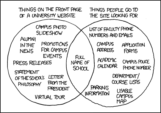
Ouch. The truth hurts.

I am printing this out and posting it everywhere in my department. Everywhere.
Source: XKCD
Ouch. The truth hurts.

I am printing this out and posting it everywhere in my department. Everywhere.
Source: XKCD
Comments are closed.
Hey Mike. Love the graphic, but can’t disagree more. If you’re at a tuition-driven institution, the home page needs to be focused on recruiting future students. Build an intranet that’s connect to the home page for current students, faculty and staff.
However, having said that, the statement of the school’s philosophy and a letter from the president don’t belong anywhere on the website – yawn!
Brian, of course our sites’ main goal is to recruit students, but I think we often get bogged down in those other areas – the president’s letter, the press releases, etc. that we lose sight of what people really want – especially stuff like campus maps, course lists, etc.
I think we all get tunnel vision sometimes and it helps to step back and remember to think about what our users want and need from our websites.
Nice venn diagram, which states the architecture of educational institutes. Simple, clear and precise.